UI Components
The first thing you need to know is that websites need to obtain an opt-in from their visitors to send them push notifications. Choosing the right format and the right moment to ask for push notification permission is key to build a successful web push strategy.
There are several formats to choose from, each one adapted to different needs:
- Alert: a customizable popup.
- Banner: a simple banner.
- Button: a button you can display in the bottom right or left corner of your website.
- Native prompt: The native prompt, in case you don't want to use any of the above formats (fully secure mode only).
UI Components (except for popup) are automatically added to your web page once you configure them. Configuring a UI component allows you to override its behaviour, position or even translations. We'll detail what configuration options are supported for every builtin UI Component.
For example, here's how a button would work in the configuration:
batchSDK(['setup', {
  ...
  ui: {
    button: {
      corner: 'bottom left',
      backgroundColor: '#FFFFFF',
      hover: 'Subscribe to our notifications!',
    }
  }
});
When in fully secure mode, you have the possibility of asking for the browser's notification optin directly. A UI Component is required for the HTTP/Multidomain mode, as a click event is required to open a popup without it being caught by browser's builtin blockers.
Alert
Requires Batch SDK 2.0.0
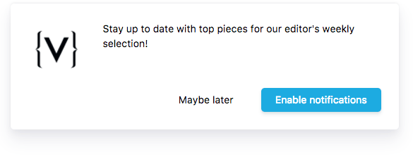
The alert format is similar to popups you can get using alert(). It is not actually modal: the user is still able to interact with the content around it.
It can show up in any of the four corners, or can be centered on the top or the bottom of the page.
To enable it, add a child object of ui named alert.
Supported parameters:
| Id | Description | |
|---|---|---|
autoShow | Boolean - Optional Whether the component should show as soon as possible, or if it should wait for a manual 'show' API call. Default: true E.g. {"autoShow":false} | |
attach | String - Optional Where to attach the alert. Should be a mix of top|bottom and left|center|right. E.g. {"attach":"bottom left"} | |
icon | URL String - Optional Link to a square icon representing your website, which will show up on the left of the banner. The file must be a PNG or JPG image hosted on an HTTPS server. E.g. {"icon":"https://mydomain.com/icon.png"} | |
text | String - Optional Overrides the text that's displayed in the banner. E.g. {"text":"Never miss an update !"} | |
backgroundColor | Hex Color String - Optional Color of the banner's background. E.g. {"backgroundColor":"#646464"} | |
textColor | Hex Color String - Optional Color of the banner's text. E.g. {"textColor":"#646464"} | |
fontSize | Integer - Optional Font size. Unitless. E.g. {"fontSize":"12"} | |
fontFamily | String - Optional Overrides the font used in the banner. Works exactly like CSS' font-family attribute. E.g. {"fontFamily":"helvetica"} | |
btnBackgroundColor | Hex Color String - Optional Color of the button's background. E.g. {"btnBackgroundColor":"#646464"} | |
btnTextColor | Hex Color String - Optional Color of the button's text. E.g. {"btnTextColor":"#646464"} | |
btnHoverColor | Hex Color String - Optional Color of the button's hover state. E.g. {"btnHoverColor":"#646464"} | |
btnFontSize | Integer - Optional Font size of both buttons in px. Do not add the unit to the value. E.g. {"btnFontSize":"12"} | |
positiveSubBtnLabel | String - Optional Text override for when the positive button will subscribe the user. E.g. {"positiveSubBtnLabel":"Subscribe"} | |
positiveUnsubBtnLabel | String - Optional Text override for when the positive button will unsubscribe the user. E.g. {"positiveUnsubBtnLabel":"Unsubscribe"} | |
negativeBtnLabel | String - Optional Text override for when the negative button, which hides for popup temporarily, until the delay in `hideFor` has been reached. E.g. {"negativeBtnLabel":"Later"} | |
positiveBtnStyle | Button style configuration - Optional Style configuration for the positive ("Subscribe"/"Unsubscribe") button. See below for more info about this object. Note: When in unsubcribe mode, this button will always have a red background color. E.g. {"positiveBtnStyle":{"textColor":"red"}} | |
negativeBtnStyle | Button style configuration - Optional Style configuration for the negative ("Later") button. See below for more info about this object. E.g. {"negativeBtnStyle":{"textColor":"red"}} | |
extraBtn | 'Extra' button configuration. Requires SDK v3. - Optional Both 'label' (Button text) and 'link' (link that will be opened in a new tab on click) attributes are required. A 'style' object can be provided in the same syntax as 'positive/negativeBtnStyle', CSS styling is also supported. E.g. {"extraBtn":{"label":"Privacy Policy","link":"https://batch.com/privacy-policy"}} | |
hideFor | Integer - Optional When closed, do not display the banner again until X seconds elapsed (default: 604800 or 7 days). Use a 0 value to hide the alert forever. E.g. {"hideFor":604800} | |
zIndex | Integer - Optional z-index of the component E.g. {"zIndex":999} | |
Alert button style configuration
| Id | Description | |
|---|---|---|
backgroundColor | Hex Color String - Optional Color of the button's background. E.g. {"backgroundColor":"#646464"} | |
hoverBackgroundColor | Hex Color String - Optional Color of the button's background when hovered. Falls back on `backgroundColor` if not specified. E.g. {"hoverBackgroundColor":"#646464"} | |
textColor | Hex Color String - Optional Color of the banner's text. E.g. {"textColor":"#646464"} | |
fontSize | Integer - Optional Font size in px. Do not specify an unit in this value. E.g. {"fontSize":"12"} | |
shadow | Boolean - Optional Whether this button should cast a shadow, or not. Default: true for the positive button, false for the negative one. E.g. {"shadow":false} | |
Example:
alert: {
    positiveBtnStyle: {
        backgroundColor: "blue",
        textColor: "white",
        fontSize: 25,
        shadow: true
    }
}
Banner
The banner shows up at the top of your webpage. It has an optional logo, a colorable button, and can be floating or fixed.
To enable it, add a child object of ui named banner.
Supported parameters:
| Id | Description | |
|---|---|---|
autoShow | Boolean - Optional Whether the component should show as soon as possible, or if it should wait for a manual 'show' API call. Default: true E.g. {"autoShow":false} | |
icon | URL String - Optional Link to a square icon representing your website, which will show up on the left of the banner. The file must be a PNG or JPG image hosted on an HTTPS server. E.g. {"icon":"https://mydomain.com/icon.png"} | |
text | String - Optional Overrides the text that's displayed in the banner. E.g. {"text":"Never miss an update !"} | |
fixed | Boolean - Optional Makes the banner push the webpage's content rather than float on top of it (default: False). E.g. {"fixed":true} | |
attachBottom | Boolean - Optional Makes the banner show on the bottom of the page, rather than on top. Forces 'fixed' to true (default: False). E.g. {"attachBottom":true} | |
backgroundColor | Hex Color String - Optional Color of the banner's background. E.g. {"backgroundColor":"#646464"} | |
textColor | Hex Color String - Optional Color of the banner's text. E.g. {"textColor":"#646464"} | |
fontSize | Integer - Optional Font size. Unitless. E.g. {"fontSize":"12"} | |
fontFamily | String - Optional Overrides the font used in the banner. Works exactly like CSS' font-family attribute. E.g. {"fontFamily":"helvetica"} | |
btnBackgroundColor | Hex Color String - Optional Color of the button's background. E.g. {"btnBackgroundColor":"#646464"} | |
btnTextColor | Hex Color String - Optional Color of the button's text. E.g. {"btnTextColor":"#646464"} | |
btnHoverColor | Hex Color String - Optional Color of the button's hover state. E.g. {"btnHoverColor":"#646464"} | |
btnFontSize | Integer - Optional Button's font size. Unitless. E.g. {"btnFontSize":"12"} | |
btnWidth | Integer - Optional Button width. Unitless. E.g. {"btnWidth":"200"} | |
btnSub | String - Optional Text override for when the button will subscribe the user. E.g. {"btnSub":"Subscribe"} | |
btnUnsub | String - Optional Text override for when the button will unsubscribe the user. E.g. {"btnUnsub":"Unsubscribe"} | |
hideFor | Integer - Optional When closed, do not display the banner again until X seconds elapsed (default: 604800 or 7 days). Use a 0 value to hide the banner forever. E.g. {"hideFor":604800} | |
zIndex | Integer - Optional z-index of the component E.g. {"zIndex":999} | |
Button
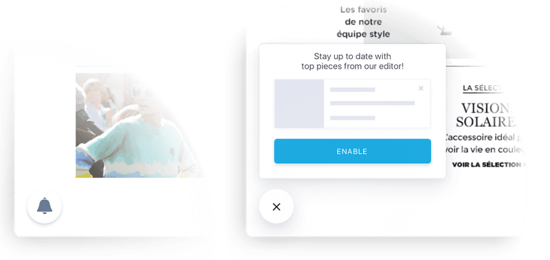
The Button UI Component shows a simple bell icon in the corner you want which, once clicked, show a pop-in with a customizable opt-in text, and a button to enable notifications.
To enable it, add a child object of ui named button.
Supported parameters:
| Id | Description | |
|---|---|---|
autoShow | Boolean - Optional Whether the component should show as soon as possible, or if it should wait for a manual 'show' API call. Default: true E.g. {"autoShow":false} | |
corner | String - Optional Corner to display the button in. Should be a mix of top|bottom and left|right. E.g. {"corner":"bottom left"} | |
hover | String - Optional Override the text that appears when hovering the button. E.g. {"hover":"Never miss an update !"} | |
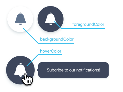
backgroundColor | Hex Color String - Optional Color of the button's background. E.g. {"backgroundColor":"#646464"} | |
foregroundColor | Hex Color String - Optional Color of the button's glyph. E.g. {"foregroundColor":"#646464"} | |
hoverColor | Hex Color String - Optional Color of the button's background on hover. E.g. {"hoverColor":"#646464"} | |
hoverForegroundColor | Hex Color String - Optional Color of the button's glyph on hover. E.g. {"hoverForegroundColor":"#646464"} | |
popin | Object - Optional Overrides the popin's properties. | |
title | String - Optional Override the pop-in's title. E.g. {"title":"Subscribe to notifications"} | |
btnSub | String - Optional Overrides the pop-in subscribe button text. E.g. {"btnSub":"Subscribe"} | |
btnUnsub | String - Optional Overrides the pop-in unsubscribe button text. E.g. {"btnUnsub":"Unsubscribe"} | |
example | Object - Optional Example notification to display instead of the placeholder. See 'Theming' for more info. E.g. {"example":{"body":"This is what a notification looks like"}} | |
zIndex | Integer - Optional z-index of the component E.g. {"zIndex":999} | |
Theming
The button theme supports full color customization of the button itself, but not the popin. Just like any other component attribute, just override the wanted value in the configuration object.
Here's what colors you can change on the button, with their property names:

You can also customize the placeholder notification in the popin, by specifying a example object under popin:
| Id | Description | |
|---|---|---|
icon | Image URL String - Optional URL of the image to display on the left of the example notification. E.g. {"icon":"https://path/to/your/image.jpg"} | |
title | String - Required Notification title text. E.g. {"title":"Test title"} | |
body | String - Required Notification body text. E.g. {"body":"Test body"} | |
Example:
button: {
    corner: 'bottom left',
    popin: {
        example: {
            icon: 'https://path/to/your/icon.jpg',
            title: 'Test title',
            body: 'Test body'
        }
    }
}
Native prompt
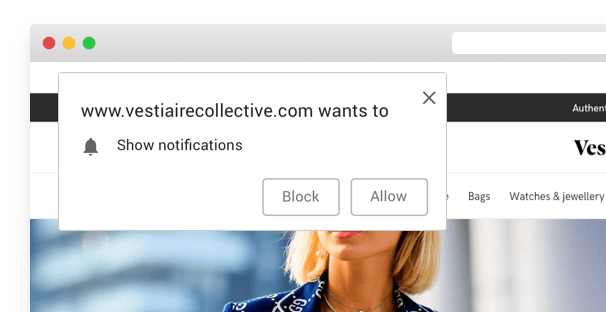
In case you don't want to use Batch's formats, you can trigger the native prompt of each browser. That permission request can be shown 3 times a week (more information here). Please note this will only work if you are using the fully secure mode.
To enable it, add a child object of ui named native.
Supported parameters:
| Id | Description | |
|---|---|---|
autoShow | Boolean - Optional Whether the component should show as soon as possible, or if it should wait for a manual 'show' API call. Default: true E.g. {"autoShow":false} | |
backoffDuration | Integer - Optional Time, in seconds. Allows you to set a delay between each display of the native prompt. Default: 86400 E.g. {"backoffDuration":86400} | |
Example:
native: {
    "backoffDuration": 86400
}
Toggling visibility programmatically
Starting with Batch SDK 2.0.0, you can programatically control the display of builtin UI components.
Two methods are available on the public API: ui.show, and ui.hide. They take as a parameter the name of a UI component that has been configured earlier, in the SDK setup:
batchSDK('ui.show', 'alert')
batchSDK('ui.hide', 'alert')
// or
batchSDK((api) => {
  api.ui.show('alert')
})
batchSDK((api) => {
  api.ui.hide('alert')
})
Note: Most components will be shown as soon as possible. In order to make them wait for your
showcall, please refer to the configuration of the UI component you're trying to tweak: look for theautoShowkey.
Note that some UI components might chose not to display even if you tell them to. Reasons can be:
- The user is already subscribed to notifications
- The user dismissed the UI element, and the minimum time between two dismissal (controlled by the
hideForconfiguration key) has not been reached.
In these cases, you can use the second "force" parameter, which allows you to force the display:
batchSDK('ui.show', 'alert', true)


